Menus matter! Converting a website visitor into a customer is often a matter of providing a good user experience. A well-constructed website menu is a major factor. What should be included? Which style is correct for your site?
Consider the following eight tips and your menu will be working for you, not against you.
Table of Contents
Make Your Menu Suit Your Purpose
A website, like a human, needs a purpose. The first step in menu planning is to decide why your website exists. Are you a large-scale retailer or service provider who thrives on the breadth of your offerings? A smaller and more specialized company looking to prompt some specific actions? An advocacy group highlighting a certain value or mission? Defining success for both yourself and your customer will help inform the rest of your menu-building decisions.
Keep Your Website Menus Simple
Less can be more. Similar to pop-ups, menus are best when overkill is avoided. Certain key pages, such as the “about”, “services”, and “contact” pages are a no-brainer for menu inclusion, as visitors expect to see them. Reducing the clutter around these options can help your visitor focus and find what they’re looking for. Just as Marie Kondo (whose website is, ironically, a little busy) advocates for disposing of things that don’t bring you joy, we suggest trimming superfluous items from your menu.
A Drop Down Menu Can Be Your Friend
We’ve established that a good website should not resemble a “Where’s Waldo?” cartoon, but it’s also important not to hide or exclude important information. Enter the drop-down menu. This approach allows you to keep your main menu nice and neat, while still providing a place for any additional pages to be listed. Remember to make the grouping of your drop-down menu items intuitive, as the goal is to make it easy for visitors to find what they’re looking for

Optimize Your Menus for Multiple Devices
When designing a menu, consider how it will look and act on computer screens, mobile devices, and tablets. Each device will display your site differently, so make sure your menu is not hiding important information, and both mouse and finger-friendly.
Avoid Mega Menus (Unless They Make Sense)
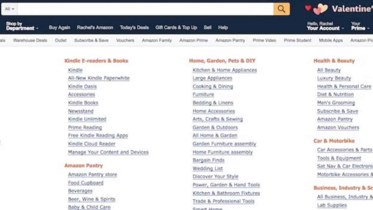
Is your name Jeff Bezos? Do people visit your site because they’re looking to find a very specific thing amongst an astronomical number of other things? If so, enjoy your mega menu. If not, consider another format.
A mega menu is just what it sounds like: an expandable menu with many, many choices. They are not without their purpose, but they are a lot to look at. The central question that should guide your menu design is this: does this menu make the site easier to navigate or not? This is web design, not monster trucks, so bigger isn’t always better. If your organization’s offerings are more streamlined than the aforementioned Amazon’s then including a mega menu on your site is a bit like hosting an intimate family gathering in a football stadium. Avoid the overkill.

Contemplate the Hamburger
You know those three little lines that lead to a drop-down menu? That’s called a hamburger menu, because, apparently, it reminds people of bread and beef. Speaking of beef, people like to argue about their value. On the one hand, they save space and they’re universally recognized. On the other hand, they hide the menu items, and do people really click them? Again, it really all boils down to your overall website aesthetic and purpose.
Don’t Have Fun with Fonts
There’s a time and place for everything, including having fun with fonts. Menus are not that place. A menu is a tool. Clarity is essential. Take your Lucida Calligraphy and Comic Sans elsewhere.
Think of Your Home Page as a Secondary Menu
Those who don’t head directly to your menu should still find what they’re looking for by scrolling the home page. Below the hero section, they should find compelling copy, imagery, and calls to action directing them toward the most important pages on your website. It’s like a de facto secondary menu that is less direct but more persuasive. The bottom part of your website (also known as the footer) is also a key area to display less important pages, providing simple navigation without cluttering the main menu.
Next Steps
Peak Ed Designs likes websites that are pleasing to look at, but we love websites that get the job done. You want to grow your business and that means maximizing the number of potential customers who cross the finish line.
With this in mind, we live for improving user experience, including intuitive menu systems. A website by Peak Ed Designs will be visually appealing and easy to navigate, allowing your website visitors to find what they’re looking for, and you to expand your customer base.
I want a website that gets the job done and helps me gain customers.

