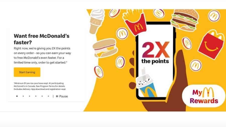
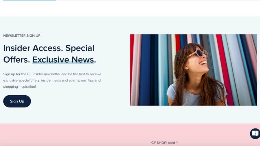
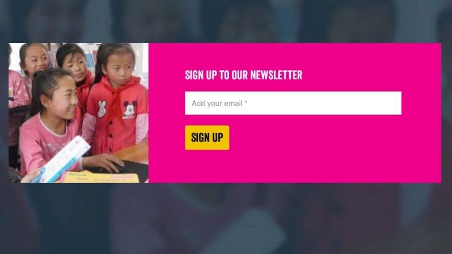
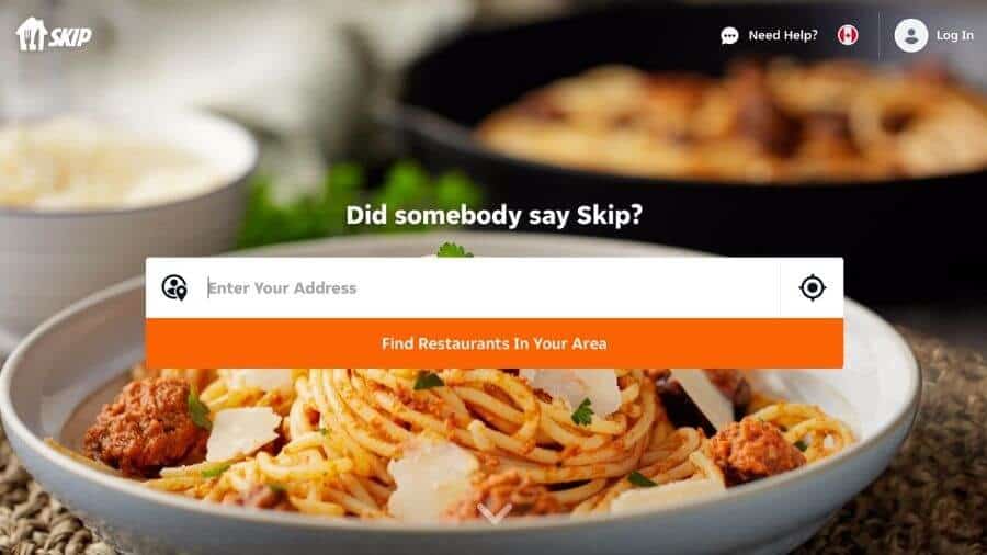
When it comes to the success of your website, it’s all about the sign-ups, opt-ins, and conversions. All sign-up forms are not created equally, however, so it’s important to put your best foot forward and present the visitor with an offer they can’t refuse. Today we’re going to find out what it takes to get things clicking. These are the five keys to increasing your sign-ups.
Table of Contents
Why Are Sign-Ups So Important?
Attracting a visit is difficult enough in the massive world of cyberspace, but securing an action is the real name of the game. Most websites are built with the hope that they’ll entice somebody to purchase a product or service, or at least take a step in that direction, nurturing the visitor to convert later. Sales are obviously the lifeblood of most organizations. Rewards club sign-ups or email subscriptions are a great way to feed your sales funnel and thrive in the long run. Enticing that sign-up is not rocket science, but it does take some effort and attention to detail.
We promised you five keys, so here they are.
Make Your Sign-Up Form Visible and Easy To Find
Don’t hide your sign-up form in some remote corner of your website in hopes that your potential customer will trip over it. Instead, put it right in their face! The home page is often the highest traffic area on a website, so near the top of that is a good place to start. Landing pages for particular aspects of your offering can also generate lots of traffic, particularly if they’re supported by strong SEO or a solid pay-per-click campaign.

Gain Conversions by Making Your Opt-In Forms Visually Attractive
Quick, ask a friend to name something beautiful. 1000 to 1 odds say they don’t say ‘a form’. People tend to think of a form as a drab-looking commitment that is to be merely tolerated. Good designers know differently. You’re trying to inspire action, so why not tie your form to a visual that reminds the reader how fantastic their life is going to be once they take this action? Like the rest of your website, it should be pleasing to the eyes and inspiring to the mind.
Persuade Sign-Ups with Engaging Copy
You know what goes well with a great visual? Great copy! One shows them what satisfaction looks like and the other describes it. Your copy should be bold and clear, encouraging them to keep reading and ultimately take action. Be warned against excessive copy on your opt-in form. Other sections of your website are more appropriate for persuasive detail, the goal here is to get somebody across the finish line before they become bored or change their mind.

Make Your Sign-Up Forms Uncomplicated
Signing up for a service or a reward should not feel like homework. While there is an obvious appeal to collecting extensive demographic information, each additional field provides your would-be participant with a brand new opportunity to say ‘forget it’. Some opt-ins, of course, will require more information than others. It’s really a matter of understanding your offering, your customer, and your business model, and discovering the appropriate balance. Don’t forget, more information can always be collected further down the line when a stronger tie has been formed.

Display the Value in Completing the Sign-Up Form
Don’t forget to offer your potential sign-up clear and obvious value. You’re probably totally enthused about your organization and can’t imagine anyone’s life being complete without being involved. Indeed many of your visitors may have sought you out because they desperately want what you’ve got. Others may have just wound up on your page. If you want them to act, you’re going to have to tell them why they should do so. This could include the benefits of your product or service, the advantages they’ll reap by signing up for your newsletter, or the incredible special deals they’ll receive when they become a member of your rewards program. Big picture benefits are great, but the promise of immediate gratification in the form of ‘special offers for those who act now’ are also strong motivators.

Next Steps
Peak Ed Designs create results-focused websites that not only look good, but also prompt action. We focus on user experience, strong SEO, and persuasive copy, ensuring that your value proposition isn’t just a good story, but a means of generating conversions and growing your business!
I want a website that prompts action and helps me grow my business.

